User guide
Portfolio
What everything on the Portfolio tab means, including the slider that snaps back.
Screenshots are from the iPhone app. The Android app has the same features, drawn in Android's own style.
Four tabs
Portfolio shows. Abdita edits. Directory is the dealer list. More holds backups, sharing, alerts, your subscription, and the privacy ledger.
That split is deliberate: the Portfolio tab is read-only. If you are looking for the button to add a holding, it is on the Abdita tab.
The market ticker
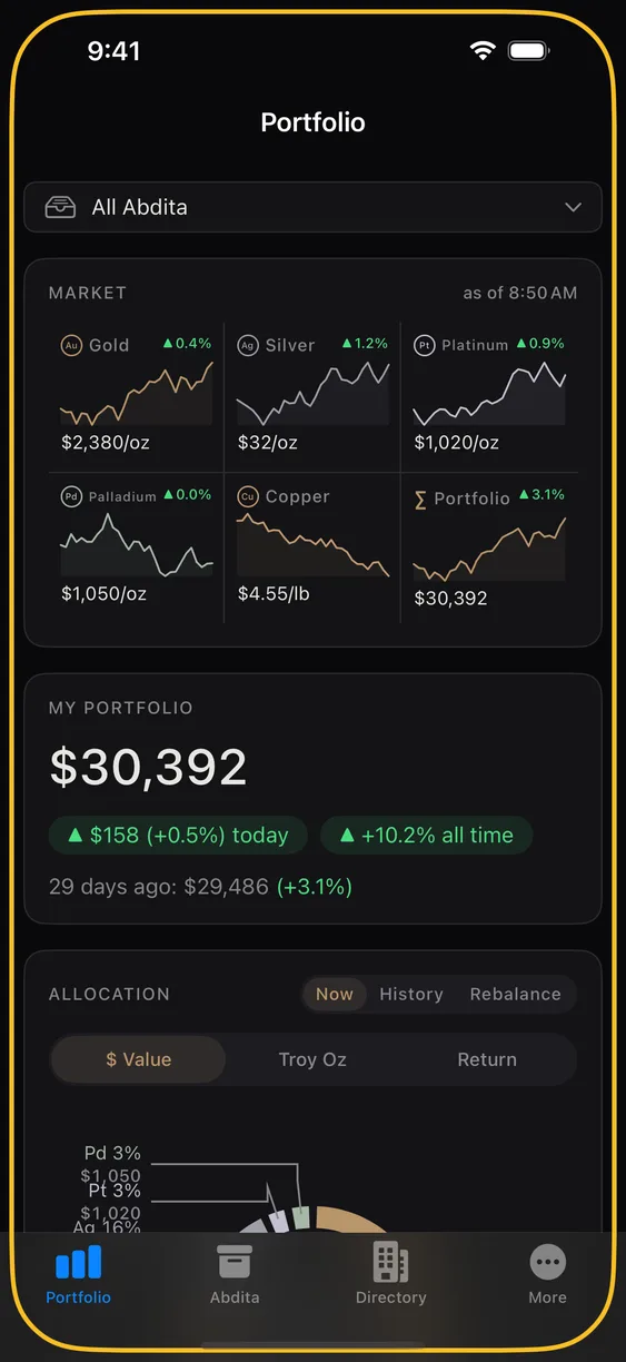
Across the top: all five metals with a sparkline, the current spot price, and the day's movement. Prices carry their unit — most metals are quoted per troy ounce, but copper is quoted per pound, which is the market convention rather than an inconsistency.
Tap any metal to open the full chart, with time-range pills.
Your total value
The large figure is everything you own, valued at current spot in your chosen currency. Below it are two comparisons: today's movement, and the change since a reference point.
That second label adapts to how much history the app has for you — it may read "one year ago", "30 days ago", or "since" a date. A new install has nothing to compare against yet, so it fills in as you use the app rather than inventing a number.
All-time gain and loss uses the purchase prices you entered. Holdings recorded without a purchase price are counted in your total value but cannot contribute a gain figure.
The allocation ring
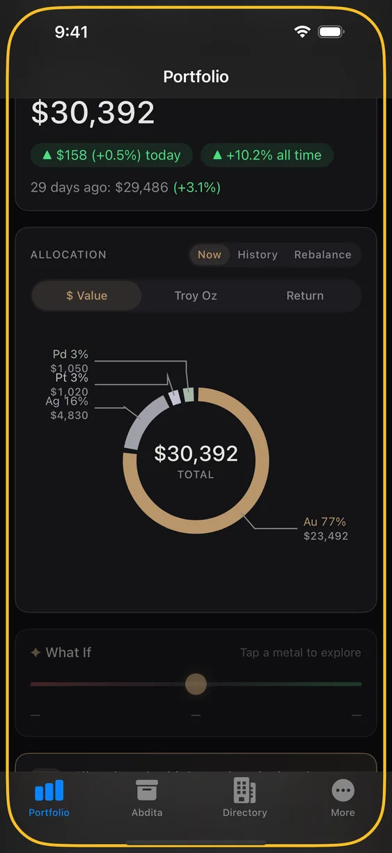
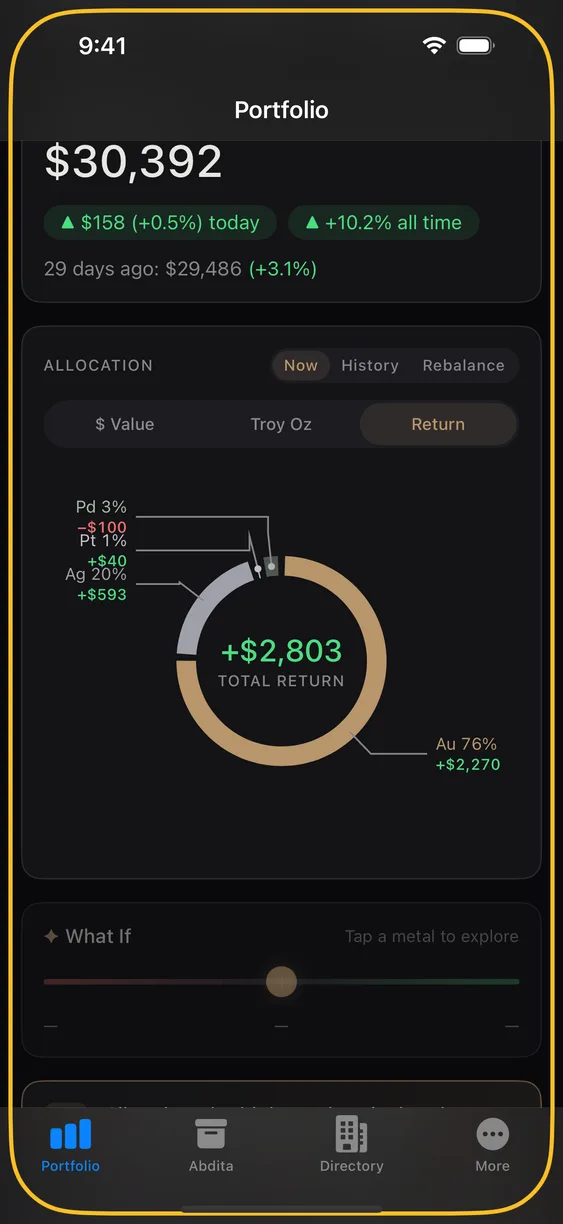
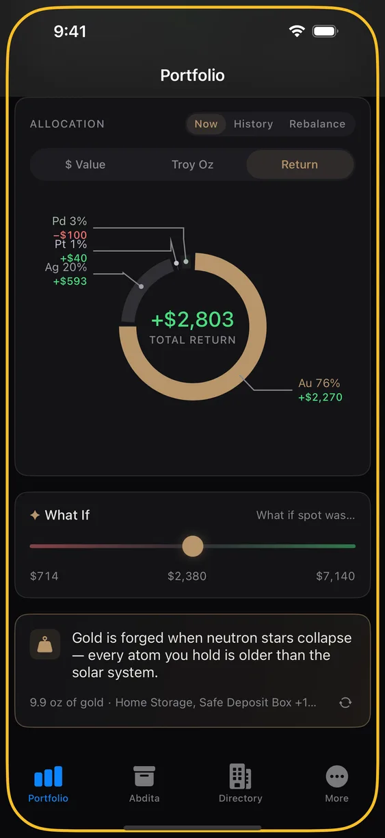
One ring, three modes, three different questions:
- $ Value — what fraction of your money is in each metal.
- Troy Oz — what fraction of your metal is in each. Silver looks very different here than it does by value.
- Return — which metals have actually earned their place.
The What If slider
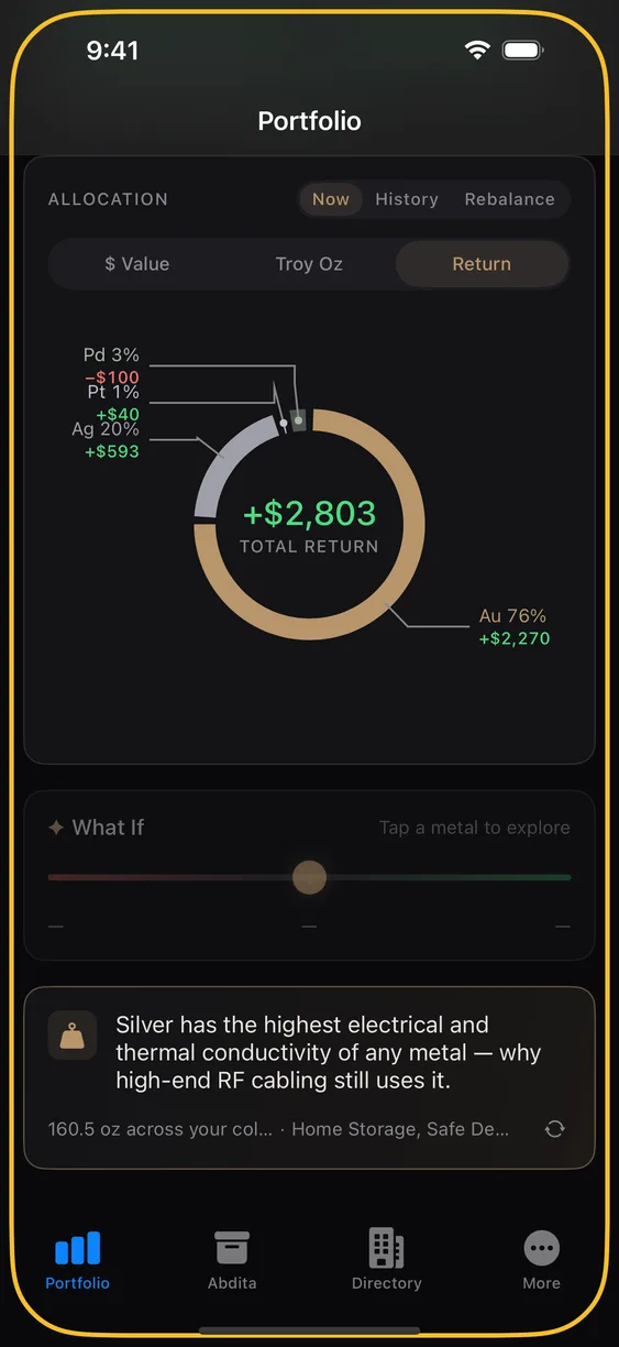
Focus a single metal and a slider appears. Drag it and your total value and the ring update live — a way to ask "what happens to me if gold moves ten percent?" without arithmetic.
Its axis follows the ring mode: in $ Value and Return it moves the price; in Troy Oz it moves the quantity you hold.
It snaps back, and that is the design
Let go and the slider returns to neutral. It is a hypothetical, not a setting — nothing you do with it changes your holdings, and nothing about it is transmitted. Every figure is computed on your phone.
Fun facts
A card at the bottom turns your collection into something you can picture — the cube your gold would form, what it would weigh in familiar terms. Tap to cycle through them; some link into the Abdita they describe.
History and rebalance
History replays how your allocation has shifted over time. Rebalance works the other way around: you say what mix you want, and it works out what to buy or sell to get there — including how a fixed amount of cash would be best spent across metals.
Limits
Chart ranges 1D, 7D and 30D are free; 90D and 1Y need Pro. One year is the longest range there is — we keep 365 days of price history and no more, so there is no "all time" view to unlock.